
Punjab State Board PSEB 8th Class Maths Book Solutions Chapter 5 Data Handling InText Questions and Answers.
PSEB 8th Class Maths Solutions Chapter 5 Data Handling InText Questions
Textual (Textbook Page No. 69 – 70)
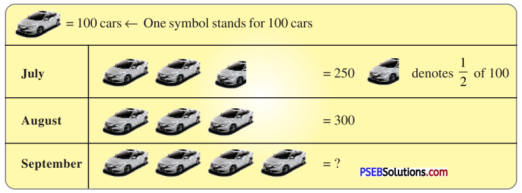
1. A Pictograph : Pictorial representation of data using symbols.
Question (i).
How many cars were produced in the month of July ?
Solution:
250 cars were produced in the month of July.
Question (ii).
In which month were maximum number of cars produced?
Solution:
Maximum number of cars were produced in the month of September.
![]()
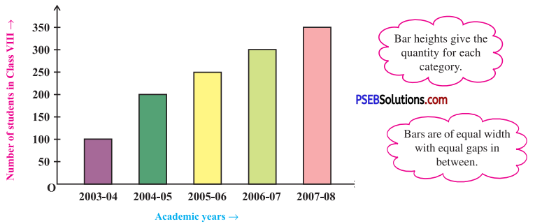
2. A Bar Graph : A display of information using bars of uniform width, their heights being proportional to the respective values.
Question (i).
What is the information given by the bar graph ?
Solution:
Here, the bar graph gives information about number of students of class VIII in different academic years.
Question (ii).
In which year is the increase in the number of students maximum ?
Solution:
In year 2004-05, the increase in the number of students is maximum.
Question (iii).
In which year is the number of students maximum ?
Solution:
In year 2007 – 08, the number of students is maximum.
Question (iv).
State whether true or false:
‘The number of students during 2005 – 06 is twice that of 2003 – 04.’
Solution :
False, the number of students during 2005 – 06 is not twice that of 2003 – 04 but more than twice.
![]()
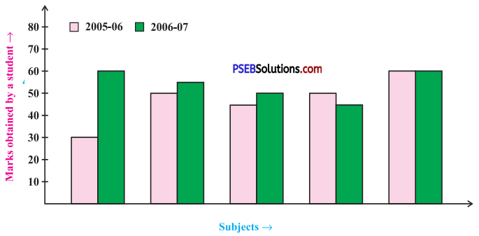
3. Double Bar Graph : A bar graph showing two sets of data simultaneously. It is useful for the comparison of the data.
Question (i).
What is the information given by the double bar graph?
Solution :
Here, the double bar graph provides information about marks obtained by a student in different subjects and comparison of his marks in year 2005 – 06 and 2006 – 07.
Question (ii).
In which subject has the performance improved the most?
Solution :
In the subject Maths, the performance has improved the most.
Question (iii).
In which subject has the performance deteriorated?
Solution :
In the subject English, the performance has deteriorated.
Question (iv).
In which subject is the performance at par?
Solution:
In the subject Hindi, the performance is at par.
Think, Discuss and Write (Textbook Page No. 71)
Question 1.
If we change the position of any of the bars of a bar graph, would it change the information being conveyed? Why?
Solution:
If the height of a bar remains unchanged, then changing of its position does not change the information being conveyed.
![]()
Try These (Textbook Page No. 71)
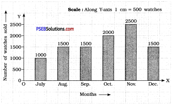
Question 1.
Draw an appropriate graph to represent the given information:
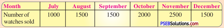
Solution:
To represent the given data by a bar graph, draw two axes perpendicular to each other. Let us represent ‘Months’ on \(\overrightarrow{\mathrm{OX}}\) and ‘Number of watches sold’ \(\overrightarrow{\mathrm{OY}}\) on OY. Let us make rectangles of same width. The heights of the rectangles are proportional to the number of watches, using a suitable scale :
Here, scale is 1 cm = 500 watches
Since, 500 watches = 1 cm
1000 watches = 2 cm
1500 watches = 3 cm
2000 watches = 4 cm
2500 watches = 5 cm
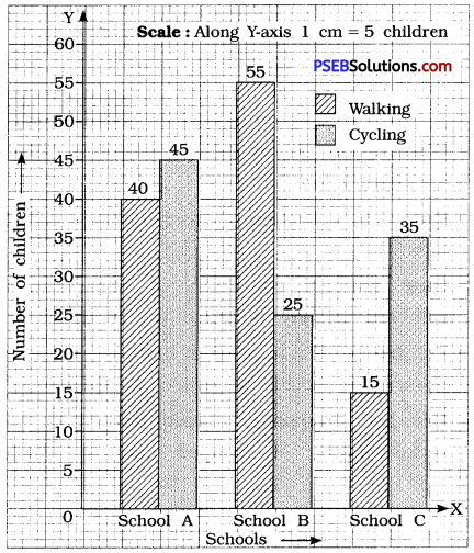
Question 2.
| Children who prefer | School A | School B | School C |
| Walking | 40 | 55 | 15 |
| Cycling | 45 | 25 | 35 |
Solution:
Since, a comparison of two activities is to be represented, therefore a double graph is drawn by taking the ‘Schools’ along X-axis and ‘Number of children’ along Y-axis, using a scale of 1 cm = 5 children.
![]()
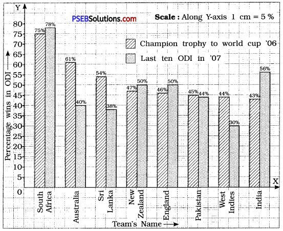
Question 3.
Percentage wins in ODI by 8 top cricket teams.
| Teams | From Champions Trophy to World Cup ’06 | Last 10 ODI in ’07 |
| South Africa | 75% | 78% |
| Australia | 61 % | 40% |
| Sri Lanka | 54% | 38% |
| New Zealand | 47% | 50% |
| England | 46% | 50% |
| Pakistan | 45% | 44% |
| West Indies | 44% | 30% |
| India | 43% | 56% |
Solution:
To compare the percentage win in ODI achieved by various teams, we represent the data by a double bar graph. We represent the ‘Team’s Names’ along the X-axis and their ‘percentage win’ along Y-axis, using the scale 1 cm – 5%.
Try These (Textbook Page No. 72)
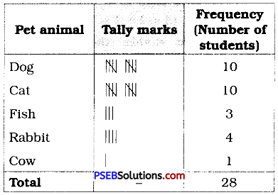
1. A group of students were asked to say which animal they would like most to have as a pet. The results are given below:
dog, cat, cat, fish, cat, rabbit, dog, cat, rabbit, dog, cat, dog, dog, dog, cat, cow, fish, rabbit, dog, cat, dog, cat, cat, dog, rabbit, cat, fish, dog.
Make a frequency distribution table for the same.
Solution:
Using tally-marks, we have
![]()
Try These (Textbook Page No. 73-74)
1. Study the following frequency distribution table and answer the questions given below.
Frequency Distribution of Daily Income of 550 Workers of a factory:
| Class Interval (Daily Income in ₹) | Frequency (Number of workers) |
| 100 – 125 | 45 |
| 125 – 150 | 25 |
| 150 – 175 | 55 |
| 175 – 200 | 125 |
| 200 – 225 | 140 |
| 225 – 250 | 55 |
| 250 – 275 | 35 |
| 275 – 300 | 50 |
| 300 – 325 | 20 |
| Total | 550 |
Question (i).
What is the size of the class intervals ?
Solution:
Class size = [Upper class limit] – [Lower class limit]
= 125 – 100
= 25
Question (ii).
Which class has the highest frequency ?
Solution:
The class 200 – 225 is having the highest frequency (140).
Question (iii).
Which class has the lowest frequency ?
Solution :
The class 300 – 325 has the lowest frequency (20).
Question (iv).
What is the upper limit of the class interval 250 – 275?
Solution:
The upper limit of the class interval 250 – 275 is 275.
Question (v).
Which two classes have the same frequency ?
Solution :
The classes 150 – 175 and 225 – 250 are having the same frequency (55).
![]()
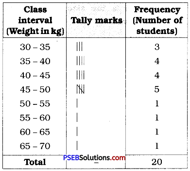
2. Construct a frequency distribution table for the data on weights (in kg) of 20 students of a class using intervals 30 – 35, 35 – 40 and so on.
40, 38, 33, 48, 60, 53, 31, 46, 34, 36, 49, 41, 55, 49, 65, 42, 44, 47, 38, 39
Solution:
Lowest observation = 31
Highest observation = 65
Class intervals :
30-35, 35-40, 40-45, ……..
The frequency distribution table for above data can be prepared as follows :
Try These (Textbook Page No. 75 – 76)
1. Observe the histogram and answer questions given below:
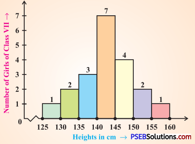
Question (i).
What information is being given by the histogram ?
Solution:
This histogram represents the heights (in cms) of girls of class VII.
Question (ii).
Which group contains maximum girls ?
Solution:
The group 140- 145 contains maximum number of girls (7).
Question (iii).
How many girls have a height of 145 cms and more?
Solution:
7 girls have a height of 145 cm and more (4 + 2 + 1 = 7).
Question (iv).
If we divide the girls into the following three categories, how many would there be in each?
150 cm and more-Group A
140 cm to less
than 150 cm – Group B
Less than 140 cm – Group C
Solution:
Number of girls in
Group A : 150 cm and more = 2 + 1 = 3
Group B : 140 cm and less than 150 cm = 7 + 4 = 11
Group C : Less them 140 cm = 3 + 2 + 1 = 6
![]()
Try These (Textbook Page No. 78)
1. Each of the following pie charts gives you a different piece of information !; about your class. Find the fraction of the circle representing each of these information:
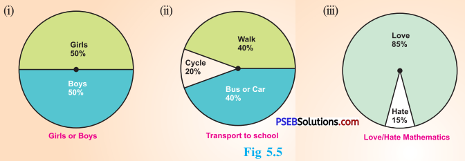
Solution:
(i) Fraction of the circle representing the ‘girls’ 50 % = \(\frac {50}{100}\) = \(\frac {1}{2}\)
Fraction of the circle representing the ‘boys’ 50% = \(\frac {50}{100}\) = \(\frac {1}{2}\)
(ii) Fraction of the circle representing ‘walk’ 40 % = \(\frac {40}{100}\) = \(\frac {2}{5}\)
Fraction of the circle representing ‘bus or car’ 40 % = \(\frac {40}{100}\) = \(\frac {2}{5}\)
Fraction of the circle representing ‘cycle’ 20 % = \(\frac {20}{100}\) = \(\frac {1}{5}\)
(iii) Fraction of the circle representing those who love mathematics = (100 – 15)%
= 85 %
= \(\frac {85}{100}\) = \(\frac {17}{20}\)
Fraction of the circle representing those who hate mathematics = 15%
= \(\frac {15}{100}\) = \(\frac {3}{20}\)
2. Answer the following questions based on the pie chart given:
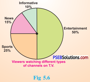
(i) Which type of programmes are viewed the most?
(ii) Which two types of programmes have number of viewers equal to those watching sports channels ?
Solution:
From the given pie chart,
| Type of viewers | Percentage |
| Sports viewers | 25 % |
| News viewers | 15 % |
| Information viewers | 10 % |
| Entertainment viewers | 50% |
(i) The entertainment programmes are viewed the most (50 %).
(ii) The news and informative programmes have the number of viewers equal to those watching sports channels (15 % + 10 % = 25 %).
![]()
Try These (Textbook Page No. 81)
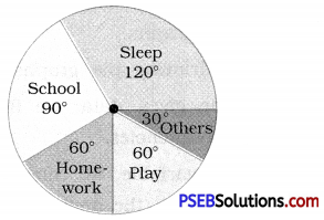
1. Draw a pie chart of the data given below : The time spent by a child during a day.
Sleep – 8 hours
School – 6 hours
Homework – 4 hours
Play – 4 hours
Others – 2 hours
Solution:
First we find the central angle corresponding to each of the given activities.
| Activity | Duration of the activity in a day out of 24 hours | Central angle corresponding to the activity |
| Sleep | 8 hours | \(\frac {8}{24}\) × 360° = 120° |
| School | 6 hours | \(\frac {6}{24}\) × 360° = 90° |
| Home work | 4 hours | \(\frac {4}{24}\) × 360° = 60° |
| Play | 4 hours | \(\frac {4}{24}\) × 360° = 60° |
| Others | 2 hours | \(\frac {2}{24}\) × 360° = 30° |
The required pie chart is given below.
[Note: Dividing a circle into sectors with corresponding angle (with protractor) you get the required pie chart.]
Think, Discuss and Write (Textbook Page No. 81)
Which form of graph would be appropriate to display the following data.
Question 1.
Production of food grains of a state.
Solution :
A bar graph will be an appropriate representation to display given data.
![]()
Question 2.
| Favourite food | Number of people |
| North Indian | 30 |
| South Indian | 40 |
| Gujarati | 25 |
| Others | 25 |
| Total | 120 |
Solution :
A pie chart (circle graph) will be an appropriate representation to display given data.
Question 3.
The daily income of a group of a factory workers:
| Daily income (in Rupees) | Number of workers (in a factory) |
| 75 – 100 | 45 |
| 100 – 125 | 35 |
| 125 – 150 | 55 |
| 150 – 175 | 30 |
Solution :
A histogram will be an appropriate representation to display given data.
Try These (Textbook Page No. 83 – 84)
Question 1.
If you try to start a scooter, what are the possible outcomes ?
Solution:
It may start.
It may not start.
Question 2.
When a die is thrown, what are the six possible outcomes?
Solution:
When a die is thrown, the possible outcomes are: 1, 2, 3, 4, 5 or 6 on the upper face of the die.
Question 3.
When you spin the wheel shown, what are the possible outcomes ? (Fig 5.9)
List them.
(Outcome here means the sector at which the pointer stops.)
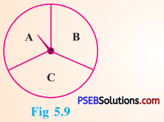
Solution:
When we spin the wheel shown, the possible outcomes are A, B or C.
[Note: The sector at which the pointer stops is outcome.]
Question 4.
You have a pot with five identical balls of different colours and you are to pull out (draw) a ball without looking at it; list the outcomes you would get (Fig 5.10).
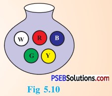
Solution:
When we draw a ball from a bag with five identical balls of different colours, the possible outcomes are : W, R, B, G or Y.
![]()
Think, Discuss and Write (Textbook Page No. 84)
In throwing a die:
1. Does the first player have a greater chance of getting a six?
Solution:
No.
2. Would the player who played after him have a lesser chance of getting a six?
Solution:
No.
3. Suppose the second player got a six. Does it mean that the third player would not have a chance of getting a six ?
Solution:
No.
Try These (Textbook Page No. 86)
Suppose you spin the wheel:

1. ( i ) List the number of outcomes of getting a green sector and not getting a green sector on this wheel.
Solution:
Number of outcomes of getting a green sector = 5
Number of outcomes of not getting a green sector = 3
(ii) Find the probability of getting a green sector.
Solution :
∴ The total number of outcomes = 8
Number of outcomes of getting a green sector = 5
∴ Probability of getting a green sector = \(\frac {5}{8}\)
(iii) Find the probability of not getting a green sector.
Solution:
∴ The total number of outcomes = 8
Number of outcomes of not getting a green sector = 3
∴ Probability of not getting a green sector = \(\frac {3}{8}\)