
Punjab State Board PSEB 8th Class Maths Book Solutions Chapter 15 Introduction to Graphs Ex 15.1 Textbook Exercise Questions and Answers.
PSEB Solutions for Class 8 Maths Chapter 15 Introduction to Graphs Ex 15.1
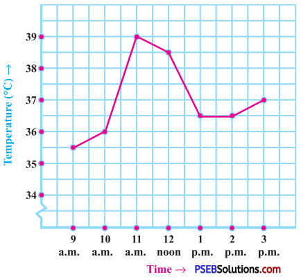
1. The following graph shows the temperature of a patient in a hospital, recorded every hour:
Question (a)
What was the patient’s temperature at 1 p.m.?
Solution:
The patient’s temperature at 1 p.m. was 36.5 °C.
![]()
Question (b)
When was the patient’s temperature 38.5 °C?
Solution:
The patient’s temperature was 38.5 °C at 12 noon.
Question (c)
The patient’s temperature was the same two times during the period given. What were these two times?
Solution:
The patient’s temperature was same (36.5 °C) at 1 p.m. and 2 p.m.
Question (d)
What was the temperature at 1:30 p.m.? How did you arrive at your answer?
Solution:
The patient’s temperature at 1:30 p.m. was 36.5 °C.
(The temperature did not change during interval of 1 p.m. and 2 p.m. So the temperature did not show any change and it was 36.5 °C at 1:30 p.m.)
Question (e)
During which periods did the patients’ temperature showed an upward trend?
Solution:
The patient’s temperature showed an upward trend during the periods 9 a.m. to 10 a.m., 10 a.m. to 11a.m. and 2 p.m. to 3 p.m., because the temperature increased during these intervals.
![]()
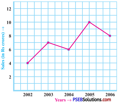
2. The following line graph shows the yearly sales figures for a manufacturing company:
Question (a)
What were the sales in (i) 2002 (ii) 2006?
Solution:
1. The sales in the year 2002 was ₹ 4 crores.
2. The sales in the year 2006 was ₹ 8 crores.
![]()
Question (b)
What were the sales in (i) 2003 (ii) 2005?
Solution:
1. The sales in the year 2003 was ₹ 7 crores.
2. The sales in the year 2005 was ₹ 10 crores.
Question (c)
Compute the difference between the sales in 2002 and 2006.
Solution:
The difference between the sales in 2002 and 2006 = ₹ (8 – 4) crore
= ₹ 4 crores
Question (d)
In which year was there the greatest difference between the sales as compared to its previous year?
Solution:
In year 2005, there was the greatest difference between the sales as compared to its previous year.
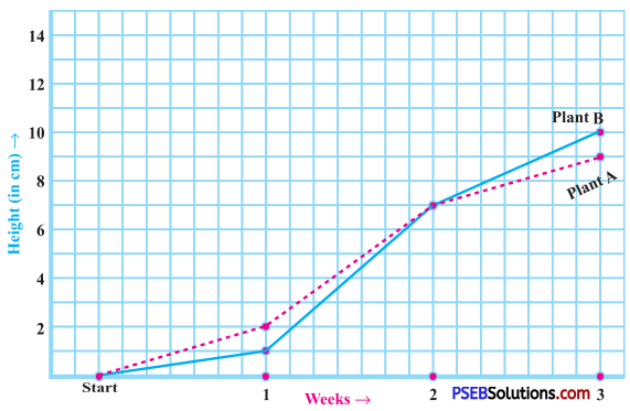
3. For an experiment in Botany, two different plants, plant A and plant B were grown under similar laboratory conditions. Their heights were measured at the end of each week for 3 weeks. The results are shown by the following graph:
Question (a)
How high was Plant A after
1. 2 weeks
2. 3 weeks?
Solution:
1. The plant A was 7 cm high after 2 weeks.
2. The plant A was 9 cm high after 3 weeks.
![]()
Question (b)
How high was Plant B after
1. 2 weeks
2. 3 weeks?
Solution:
1. The plant B was 7 cm high after 2 weeks.
2. The plant B was 10 cm high after 3 weeks.
Question (c)
How much did Plant A grow during the 3rd week?
Solution:
Plant A grew (9 cm – 7 cm) = 2 cm during 3rd week.
Question (d)
How much did Plant B grow from the end of the 2nd week to the end of the 3rd week?
Solution:
The plant B grew (10cm-7cm) = 3 cm from the end of 2nd week to the end of 3rd week.
Question (e)
During which week did Plant A grow most?
Solution:
The growth of the plant A During the 1st week = 2 cm – 0 cm = 2 cm
During the 2nd week = 7 cm – 2 cm = 5 cm
During the 3rd week = 9 cm – 7 cm = 2 cm
Thus, during the 2nd week, the plant A grew the most.
![]()
Question (f)
During which week did Plant B grow least?
Solution:
The growth of the plant B.
During the 1st week = 1cm – 0 cm
= 1 cm
During the 2nd week = 7 cm – 1 cm
= 6 cm
During the 3rd week = 10 cm-7 cm
= 3 cm
Thus, the plant B grew the least in the first week.
Question (g)
Were the two plants of the same height during any week shown here? Specify.
Solution:
At the end of 2nd week, both the plants were of the same height, that is 7 cm.
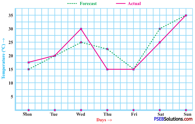
4. The following graph shows the temperature forecast and the actual temperature for each day of a week.
Question (a)
On which days was the forecast temperature the same as the actual temperature?
Solution:
The forecast temperature was the same as the actual temperature on Tuesday, Friday and Sunday.
![]()
Question (b)
What was the maximum forecast temperature during the week?
Solution:
The maximum forecast temperature during the week was 35 °C.
Question (c)
What was the minimum actual temperature during the week?
Solution:
The minimum actual temperature during the week was 15 °C.
Question (d)
On which day did the actual temperature differ the most from the forecast temperature?
Solution:
On Thursday, the actual temperature differed the most from the forecast temperature (7.5 °C).
Difference of temperature:
- Monday : 17.5 °C – 15 °C = 2.5 °C
- Tuesday : 20 °C – 20 °C = o°c
- Wednesday : 30 °C – 25 °C = 5°C
- Thursday : 22.5 °C – 15 °C = 7.5 °C
- Friday : 15 °C – 15 °C = o°c
- Saturday : 30 °C – 25 °C = 5°C
- Sunday : 35 °C – 35 °C = o°c
5. Use the tables below to draw linear graphs:
Question (a)
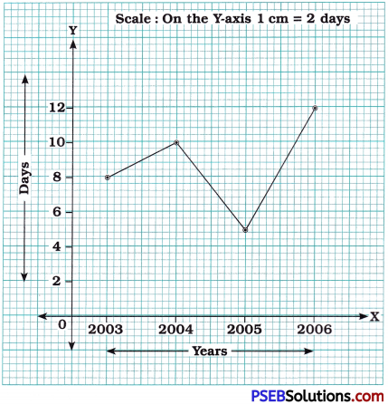
The number of days a hillside city received snow in different years:
| Year | 2003 | 2004 | 2005 | 2006 |
| Days | 8 | 10 | 5 | 12 |
Solution:
Linear graph to show snowfall in different years:
![]()
Question (b)
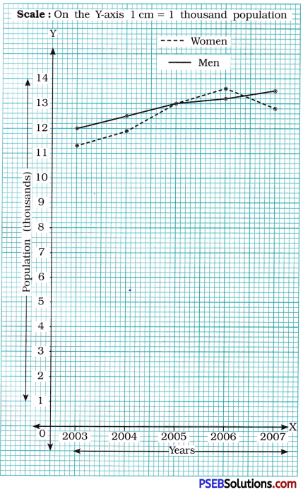
Population (in thousands) of men and women in a village in different years:
| Year | 2003 | 2004 | 2005 | 2006 | 2007 |
| Number of Men | 12 | 12.5 | 13 | 13.2 | 13.5 |
| Number of Women | 11.3 | 11.9 | 13 | 13.6 | 12.8 |
Solution:
Draw two perpendicular lines on the graph paper. Take year along X-axis (horizontal line) and population (in thousand) along Y-axis (vertical line).
For men: Mark the points (2003, 12), (2004, 12.5); (2005, 13); (2006, 13.2) and (2007, 13.5) and join them.
For women: Mark the points (2003, 11.3); (2004, 11.9); (2005, 13); (2006, 13.6) and (2007, 12.8) and join them.
![]()
6. A courier cycles from a town to a neighboring suburban area to deliver a parcel to a merchant. His distance from the town at different times is shown by the following graph:
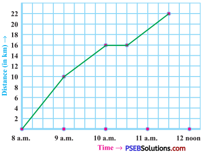
Question (a)
What is the scale taken for the time axis?
Solution:
The time is taken along the X-axis. The scale along X-axis is 4 units = 1 hour.
Question (b)
How much time did the person take for the travel?
Solution:
Total travel time taken by a courier : = 8:00 am to 11:30 am = 3\(\frac {1}{2}\) hours
Question (c)
How far is the place of the merchant from the town?
Solution:
Distance of the merchant from the town is 22 km.
Question (d)
Did the person stop on his way? Explain.
Solution:
Yes, the stopage time = 10:00 am to 10:30 am. This is indicated by the horizontal part of the graph.
Question (e)
During which period did he ride fastest?
Solution:
He rode fastest between 8:00 am and 9:00 am.
![]()
7. Can there be a time-temperature graph as follows? Justify your answer.
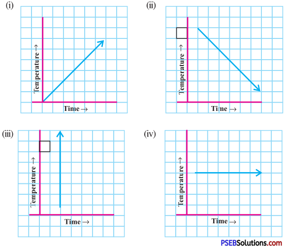
Solution:
In case of (iii), the graph shows different number of temperatures at the same time which is not possible.
∴ Case (iii) does not represent a time-temperature graph.